Asia Park
Brand Identity
2020

Sun Group had a plan to reposition all of their amusement parks, starting with the first one – Sun World Danang Wonders. We were chosen to be a part of this campaign from the very first steps as a strategic consulting and design agency.
Our challenge was spreading the enthusiasm, the joy, and the colorful experience of Asia Park through the new brand’s identity. After creating diversified options, we finally found out the best one that can deliver the spirits of Asia Park.
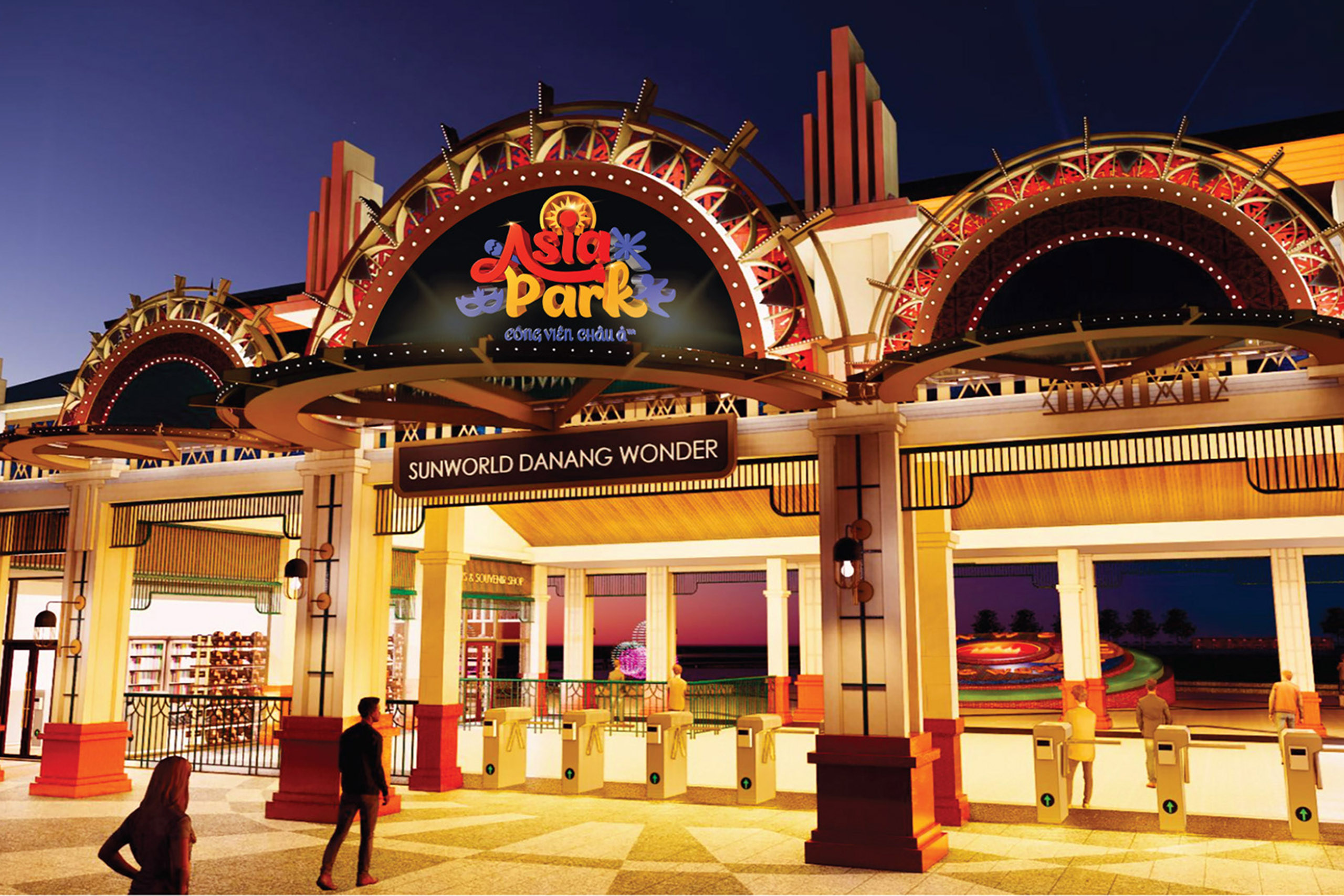
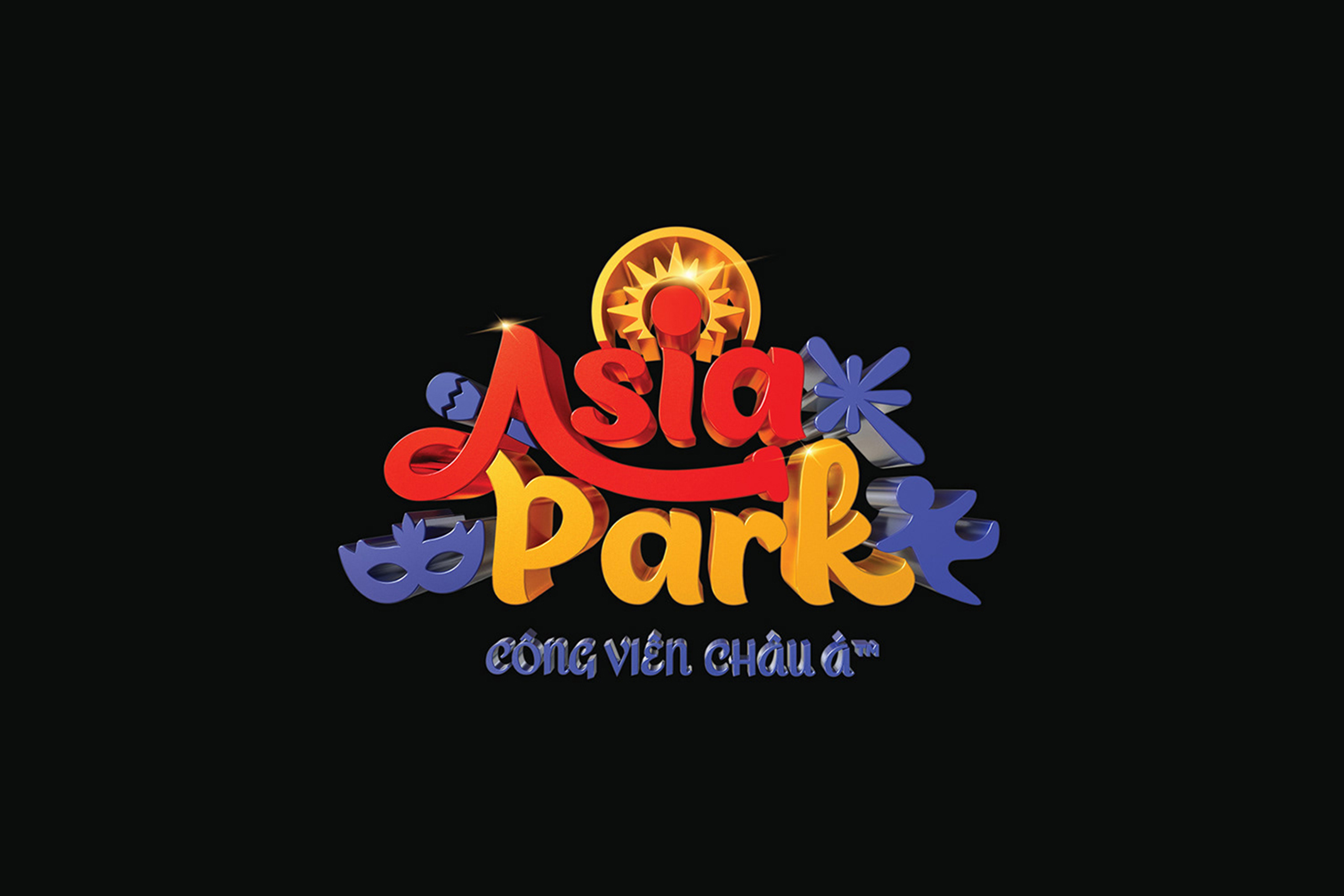
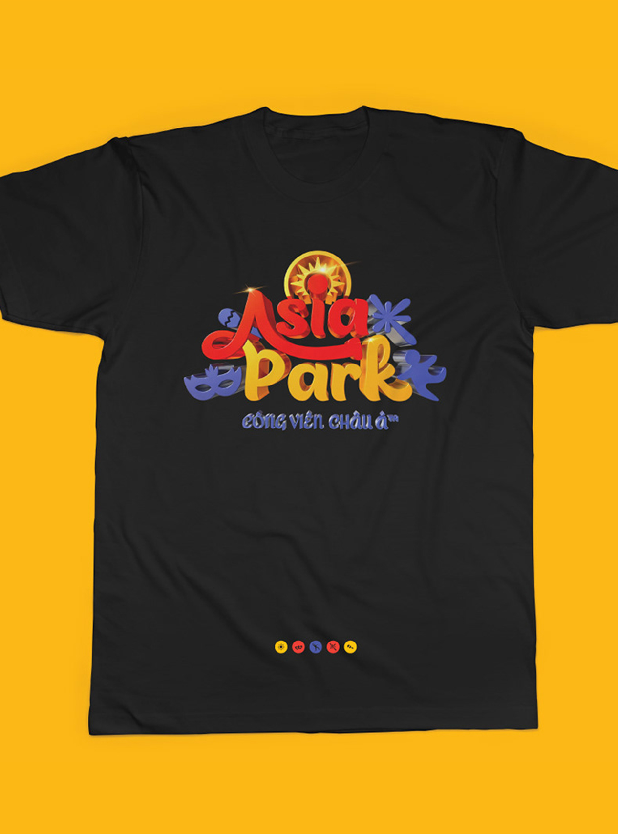
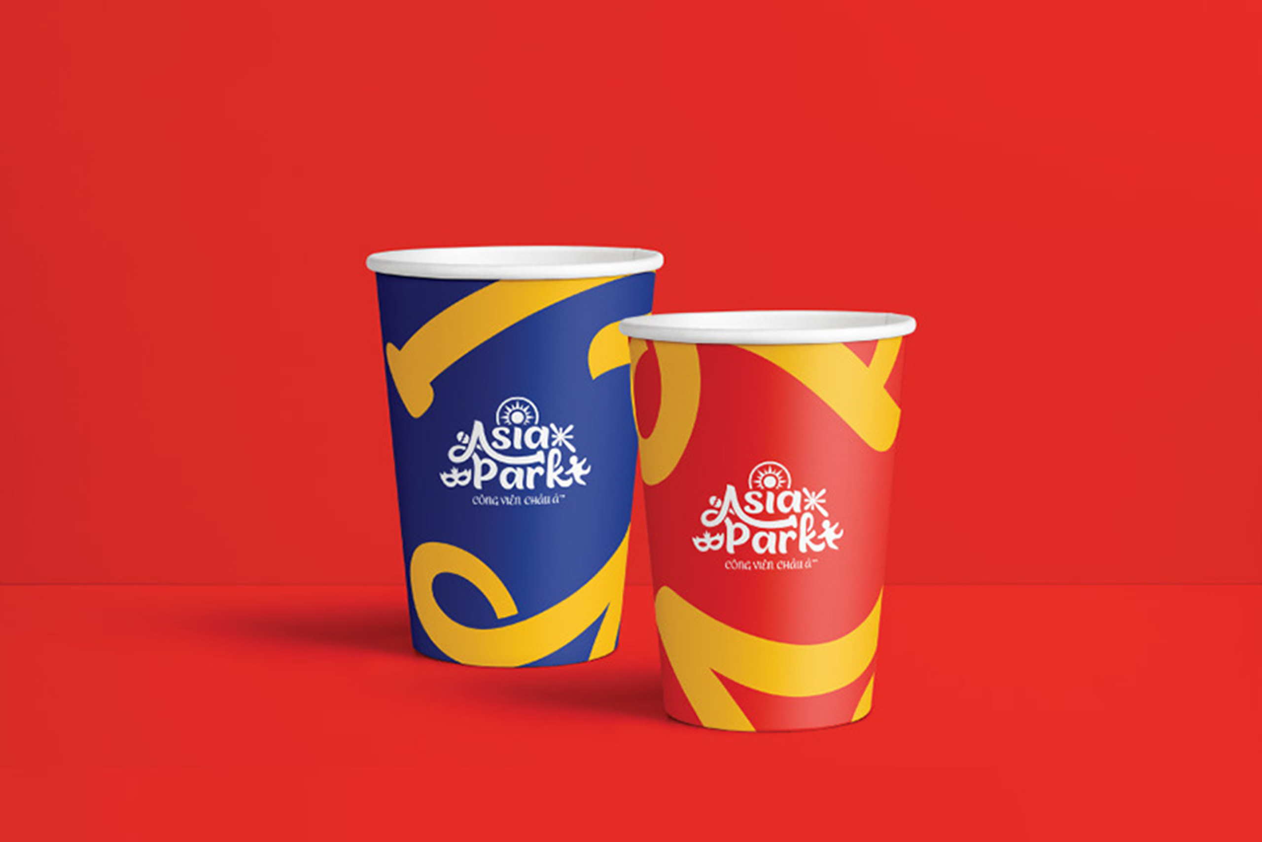
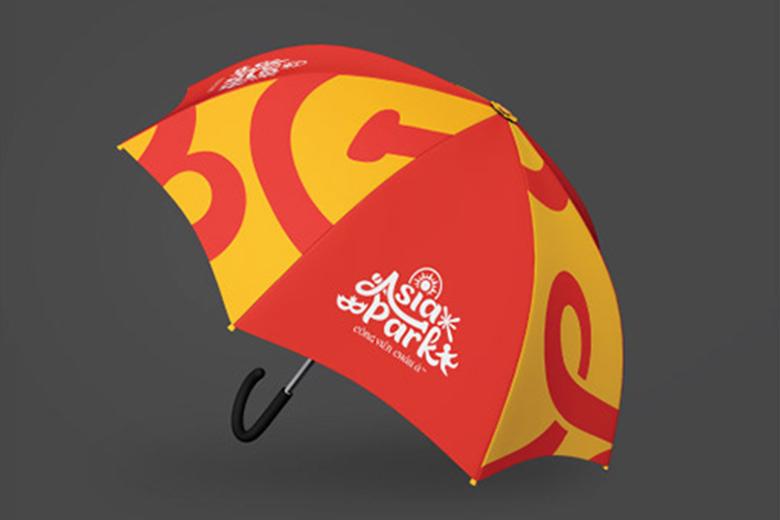
We chose to focus on the typography of the brand’s name by creating dynamic, chaotic, and connective handwriting. Besides, we developed several elements that convey the meaning of joy, entertainment, and a festive atmosphere. And the most special imprint of the logo is the “I” letter that was stylized to simulate the giant wheel – the symbol of Asia Park, and the sun which represents Sun Group. All elements were skillfully interweaved to become the final logo that brings a fresh, modern, dynamic and joyful look for Asia Park.
Details
Client
Asia Park – Sun World
View more
https://www.behance.net/incamedia
Year
2020
Scope of work
